
So, you’ve set your targets (2.1) and your tracking is verifying results (2.2). Great. Now, where are you actually sending people who click your ads? And more importantly, is that page ready to turn that expensive click into a customer?
Think about it: effective paid media often boils down to two main parts:
a) Getting the right customer to your website via the ad.
b) Your website doing the rest – converting that visitor.
Too many businesses focus only on the ads and forget that a leaky landing page sinks the whole ship. You can have the best ad in the world, but if it sends people to a confusing, slow, or untrustworthy page, you’ve just wasted your money.
Where to Send Ad Traffic? The Path of Least Resistance
Imagine you’re scrolling through Instagram Reels or TikTok. You see an ad for a pair of seriously cool sneakers, you tap it instinctively. What happens next is crucial.
Bad Scenario: The link dumps you on the brand’s homepage. Now you have to do the work – figure out where the shoes are, navigate menus, maybe search… Forget it. You’re probably back to scrolling within seconds. Your buying intent, which was high for that specific shoe, just evaporated due to friction.
Good Scenario: The link takes you directly to the product page for those exact sneakers shown in the ad. You see clear images, the price, description, and a big ‘Add to Cart’ button. Simple, direct, relevant.
Rule #1: Send paid traffic to the most relevant page possible. For product ads, this is almost always the specific product page. Minimize the steps and thinking required for the visitor. They saw cool shoes, take them straight to the cool shoes.
First Impressions: Match the Message & Be Clear Instantly
Remember, the visitor likely forgot the exact ad creative the second they clicked. Your landing page needs to immediately reassure them they’re in the right place and reiterate the core value proposition.
Headline & Visuals: Does the main headline and hero image/video clearly match what the ad promised? If the ad showed green shoes, the page must prominently feature green shoes. Any disconnect creates confusion and kills trust instantly.
Clarity: Is it immediately obvious what the product is, who it’s for, and what the main benefit is? Don’t make people hunt for information. Here’s a simple test: Imagine your dad, maybe someone around 60 who isn’t glued to technology 24/7, landing on this page. Would he instantly understand what you’re selling? Would he know exactly where to click to buy it? Or would he get lost in confusing jargon, distracting pop-ups, or unclear navigation? If your page wouldn’t pass the ‘dad test,’ it’s likely too complicated for many potential customers coming from a quick ad click. Keep it simple and direct.
Common Conversion Killers You MUST Check
These might seem basic, but they sink campaigns daily:
Load Speed: If your page takes more than a few seconds to load, a huge chunk of visitors will leave before it even appears. This is especially true on mobile.
Action: Test your page speed using tools like Google PageSpeed Insights. Optimize images, use good hosting, and fix technical issues slowing it down. Test speed from the perspective of the countries you’re targeting.
Mobile Experience: Is your page easy to view and use on a phone? Pinching and zooming to read text or hit tiny buttons? Forget about conversions. It must be fully responsive and mobile-friendly.
Payment Options: Especially crucial if selling internationally. Do you offer the payment methods common in your target market? (Example: Greece often uses Pay on Delivery). Are modern, easy options like Apple Pay / Google Pay available and working? Broken or missing payment options are conversion killers at the final step.
The Call-to-Action (CTA): Make it Obvious
What do you want the visitor to do? Buy now? Add to cart? Sign up?
Your primary CTA button should be prominent, clear, and action-oriented (e.g., “Add to Cart,” “Buy Now,” “Get Your Quote”). Think back to the ‘dad test’ – would the button be immediately obvious to him? Is the text clear about what happens when clicked?
Don’t hide it below the fold or make it blend into the background.
Avoid multiple competing CTAs that confuse the visitor. Focus on the main conversion goal for that page.
Build Trust – Fast
People buying from an ad often don’t know your brand. You need to build credibility quickly:
Social Proof: Customer reviews, ratings, testimonials.
Security: Visible trust badges (SSL certificate lock, secure payment logos).
Clarity: Clear shipping & return policy information easily accessible.
Contact Info: Makes you look like a real, reachable business.
Using Your Funnel Metrics to Diagnose Landing Page Issues
Remember those target costs we estimated in Article 2.1 (CPLPV, ATC Cost, IC Cost)? Now they become your diagnostic tools for the landing page:
High Cost per Landing Page View (CPLPV)? Could be ad relevance, or your page is loading too slow, causing people to bounce before the Pixel even fires properly. Check page speed first!
Good CPLPV, but High Cost per Add to Cart (ATC Cost)? People are landing, but not taking the first step. Ask why:
Misleading Info? Does the page fail to deliver on the ad’s promise? (Wrong product, different price/offer).
Low Quality Perception? Do the page design, images, or copy make the product seem cheap or untrustworthy?
Not Educated Enough? Is the product description unclear? Benefits not highlighted? Key questions unanswered?
No Trust? Missing reviews, security seals, clear policies?
Simply Not Needed/Wanted? Maybe the offer itself isn’t compelling to this audience (we’ll refine audience/offer later, but the page must present it well).
Good ATC Cost, but High Cost per Initiate Checkout (IC Cost)? They add to cart but don’t proceed. Often issues after the product page:
Shipping Cost Shock? Are shipping costs revealed too late and are they too high?
Confusing Cart Page? Is it hard to navigate or update the cart?
Good IC Cost, but High Cost per Purchase (CPA)? They start checkout but don’t finish. This points to checkout process problems:
Payment Issues? Missing options (Apple Pay, Google Pay, local methods)? Payment gateway errors? Security concerns?
Forced Account Creation? Guest checkout is often preferred.
Form Too Long/Complex?
Your Quick Landing Page Pre-Flight Checklist: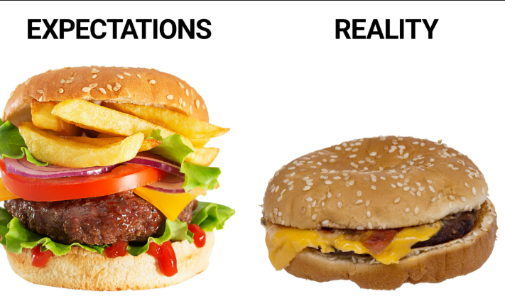
Before sending paid traffic, quickly sanity-check your destination page:
Relevance: Does it directly match the ad message/product?
Speed: Does it load quickly (check PageSpeed Insights)?
Mobile: Is it flawless on a smartphone?
Clarity: Is the offer/product instantly understandable? Headline clear? Passes the ‘dad test’?
CTA: Is the main Call-to-Action obvious and compelling?
Trust: Are basic trust signals present (reviews, security, policies)?
Functionality: Do all buttons work? Does the checkout process flow smoothly (test it!)?
Don’t Underestimate Your Website’s Role
Your landing page isn’t just a passive receptacle for traffic; it’s an active part of your sales machine. Optimizing it based on data and best practices is just as important as creating good ads. Get the page right, and you give your ad spend a much better chance of delivering profitable results.
Next Up: Fueling the Engine
Okay, your targets are set, tracking is ready, and your landing page is polished. Now for the final preparation step: deciding how much fuel (money!) to put in the engine for your first test drive. Let’s talk budgeting in Article 2.4.
Leave a Reply